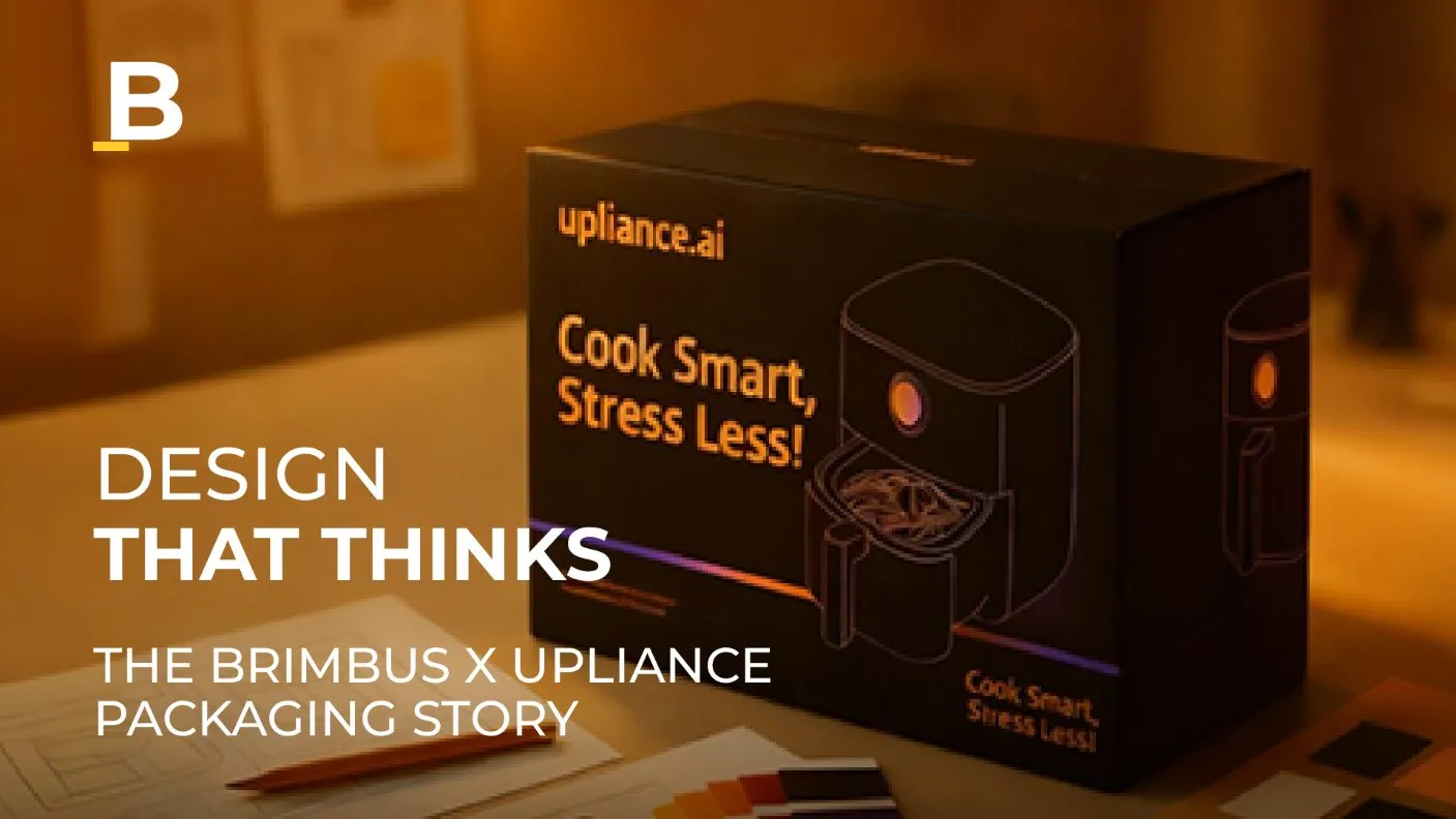
How Brimbus Made the Packaging of Upliance AI a Next-Level Success
Recent Posts
Share this article:
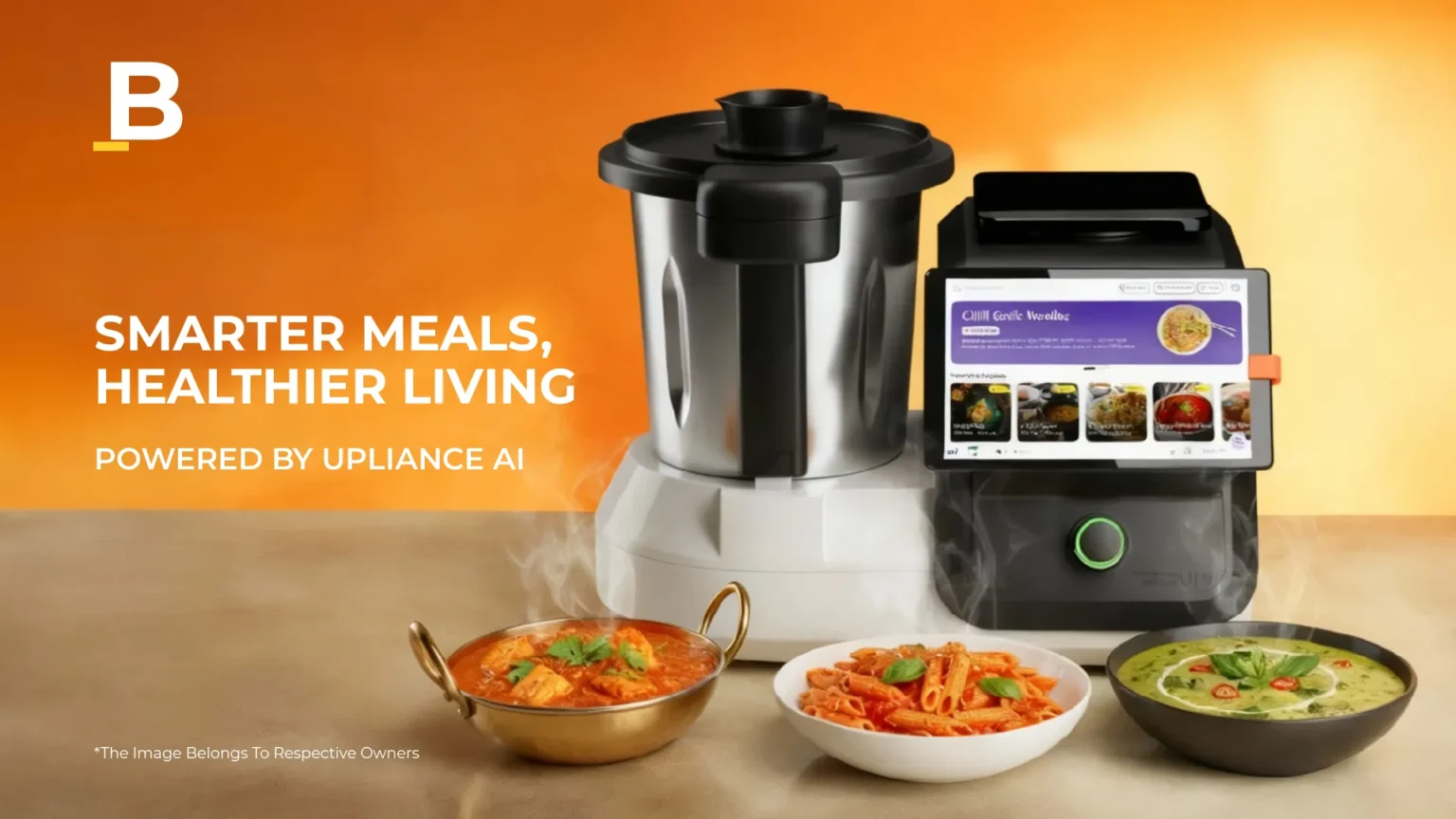
In the changing world of smart living, few products connect lifestyle and technology as well as Upliance AI. It’s not just a cooking assistant; it’s also a design statement for the modern kitchen. Before a consumer even turns it on, their first experience is with the box it comes in.
That moment of unboxing is not just a simple prelude; it’s part of the product’s identity. Brimbus, the design house that created Upliance’s packaging, took on the challenge to make the packaging not just protective but also engaging.
The brief seemed straightforward: create a packaging system that showcases Upliance’s innovation, lifestyle appeal, and technical sophistication. However, beneath that surface was a series of complex questions about perception, proportion, and purpose. How do you translate “smart” into structure? How can you make sustainability feel premium? How can cardboard, typography, and colour tell a story of intelligence and warmth?
For Brimbus, the solution lay in orchestration rather than decoration. Every layer, fold, and graphic became a note in a visual symphony, designed to reflect Upliance’s philosophy of effortless intelligence.
This is the story of how Brimbus transformed packaging into an experience where design met technology, aesthetics met function, and the box became as memorable as its contents.
Understanding Upliance AI and Its Market
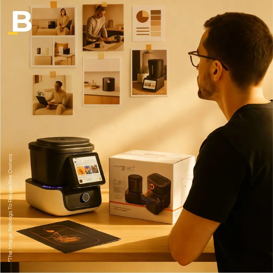
Every design journey starts with empathy, understanding, before creating. Brimbus immersed itself in the world of Upliance: the evolving landscape of smart lifestyle products where form, function, and feeling intersect.
- The Context of Smart Living
The modern Indian home blends global aspirations with local sensibilities, mixing efficiency with emotion. Upliance was made for this context, catering to a new Indian consumer who sees technology as a lifestyle enabler, not a luxury.
These individuals want their devices to be smart yet intuitive, sophisticated yet human. They don’t just buy appliances; they invest in experiences that simplify their daily lives. For them, a product must not only work well; it must feel right.
- The Market Psychology
In this space, packaging serves as the first handshake. It carries significant weight in perception, shaping how innovation is received. Brimbus recognised early on that the Upliance audience is design-sensitive but often short on time. They value clarity, dislike excess, and look for assurance in subtlety.
As a result, the packaging needed to achieve three goals:
- Signal intelligence without being sterile.
- Reflect warmth without sacrificing precision.
- Convey value without relying on decoration.
Brimbus viewed the market not as a demographic but as a mindset: modern, discerning, aspirational, and highly visual. The solution had to speak this emotional language.
Brimbus’ Packaging Approach for Upliance AI
Good design, when executed well, shows empathy. Brimbus thought of Upliance’s packaging not as a mere box but as a storytelling medium, where material, typography, and form became characters in the brand narrative.
1. Purposeful Minimalism
When applied incorrectly, minimalism can seem cold or incomplete. Brimbus treated minimalism as a discipline instead of just an aesthetic. Every graphic element was evaluated for its purpose. Every colour needed to express emotion; every surface required intention.
The front of the packaging was designed as a calm canvas with negative space, subtle brand embossing, and a clear hierarchy of information. It whispered intelligence rather than shouting innovation.
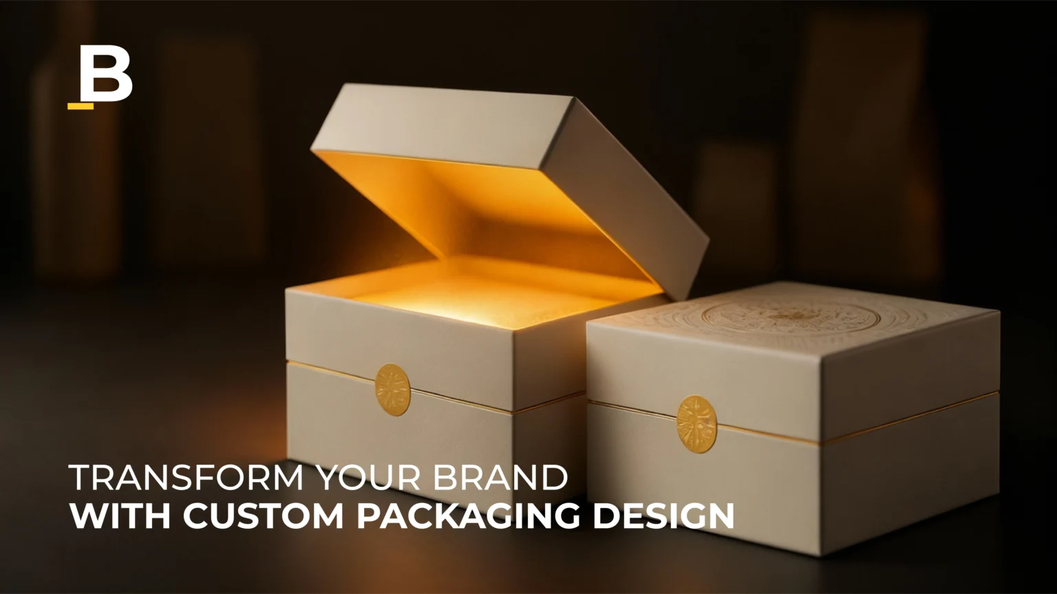
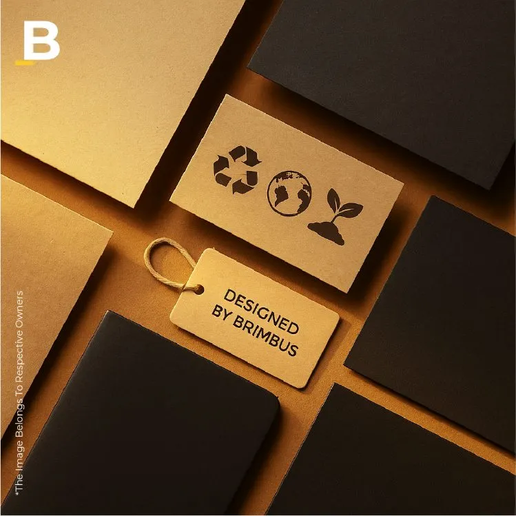
2. Material Integrity
In a time when sustainability often competes with luxury, Brimbus aimed to merge the two. The studio selected recyclable, high-density kraft substrates that felt substantial while being responsible. Soft-touch coatings added tactile warmth, while strategic lamination ensured durability without excessive gloss.
The materials were chosen not to imitate luxury but to redefine it through honest texture, restrained colour, and lasting form. The packaging aimed not to dazzle but to endure.
3. Unboxing as Theatre
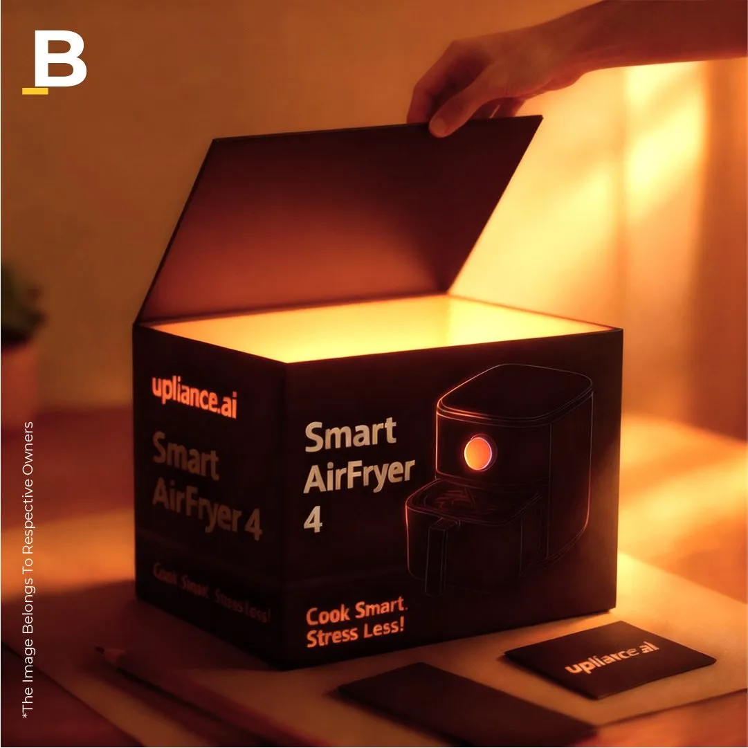
Brimbus viewed unboxing as choreography, a tactile ritual that builds anticipation. The structure unfolded in layers, each providing clarity and discovery.
The outer sleeve opened smoothly. The inner compartments were intuitively arranged, guiding the user’s hands through an intended flow. Instruction cards appeared at the right moment, with the product secure in stylish yet protective moulds.
The experience felt intuitive, like beginning a conversation with design itself.
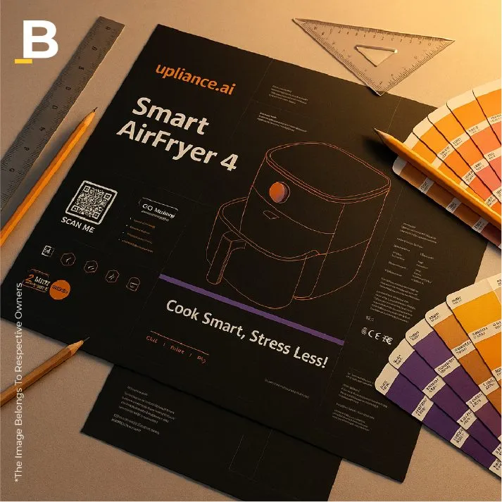
4. Typography and Tone
Typography became the brand’s voice: clear, modern, and confident. Brimbus used a geometric sans-serif typeface with soft terminals, balancing precision with warmth. The typographic layout reflected the brand’s UX tone: calm, guiding, and trustworthy.
The Design Journey: From Concept to Creation

Every design journey balances imagination with practicality, aesthetics with logistics. The development of Upliance’s packaging unfolded through ongoing dialogue, prototyping, and constant adjustments.
Phase One: Ideation and Narrative Framing
The process started with words, not visuals. Brimbus initially articulated what Upliance represented. The internal team created “narrative boards” to define emotional keywords: clarity, calm, intelligence, warmth. These became guiding principles for all following decisions.
Sketches explored various structures: rigid boxes, drawer systems, modular folds, magnetic locks. The aim was to create a design that balanced production efficiency with engaging interaction.
Mood boards drew inspiration from architectural references, such as Tadao Ando’s light play, Japanese wabi-sabi textures, and Dieter Rams’ minimalist approach. The design team focused on meaning through reduction rather than chasing superficial beauty.
Phase Two: Prototyping and Material Trials
Brimbus tested multiple substrates to achieve the right balance between strength and sustainability. The team conducted tactile tests to ensure the packaging “felt intelligent” in hand.
Prototype A: Heavyboard base with gloss lamination was rejected for feeling too conventional.
Prototype B: Matte recycled board was selected for its warmth but needed more reinforcement.
Prototype C: Dual-layer structure with an embedded magnetic lock was chosen for its balance of durability and delight.
The color palette evolved from stark white to a soft off-white with muted graphite accents, a tone that felt aspirational yet grounded.
Phase Three: Integration with Brand Ecosystem
While packaging design was happening, Upliance’s digital and retail identity was also in development. Brimbus ensured consistency across platforms: the same typographic grid used in the app appeared subtly on the box; iconography maintained similar proportions.
Packaging bridged the physical and digital identities.
Phase Four: Final Engineering
No design is finished until it works for logistics. Brimbus collaborated closely with Upliance’s production team to optimise for mass manufacturing, ensuring the premium feel stayed consistent at scale.
Fold sequences were adjusted to minimise material waste; die-lines refined for better packing efficiency. Even the ink formulation was improved to lower the carbon footprint while maintaining vibrancy.
By the end of this journey, what came forth was not just packaging; it was a collaboration between craft and conscience.
The Result: Packaging That Reflects Innovation

When the final version of the Upliance AI box was placed on the table, it felt natural, as if it could not have been designed any other way.
The first impression was silence: clean surfaces, restrained colours, and an elegance from proportion. As one engaged with it, the design revealed layers of depth. The soft texture invited touch. The typography guided the eye with quiet confidence. The internal structure unfolded logically and gracefully. There were no loud gestures, no flashy signs of futurism. Instead, there was elegance that came from precision and proportion, much like a well-crafted architectural plan commands admiration through its stillness. It was a design that didn’t demand attention but drew it in through balance and clarity.
The chosen hues were intentional. The soft neutral base allowed the product to shine, while subtle accent colours hinted at the brand’s tech-forward nature. This was innovation expressed through discipline rather than flamboyance. Brimbus understood that visual restraint, paired with tactile depth, creates a sophistication that feels intuitively premium.
- A Mirror to the Brand
The packaging reflected Upliance’s brand philosophy. It didn’t shout “smart”; it embodied it. Every action from opening to storing continued the product’s design logic: intuitive, efficient, and aesthetically pleasing.
Most packaging designs aim to represent a brand. Brimbus went further; it sought to embody it.
Representation ends with visuals like logos, colours, and typography. Embodiment, in contrast, operates on a behavioural level – how the packaging moves, feels, sounds, and interacts.
In this project, Brimbus recognised that for a product centred around intuitive intelligence, the packaging had to display that intelligence too. The result was a design that didn’t announce “smart” through flashy graphics or tech imagery; it felt smart through its composure and flow.
Brimbus succeeded in transforming packaging into a reassuring ritual. It communicated to the consumer: “You’ve made the right choice.”
- Sustainability as a Statement
Importantly, the sustainable design choices did not seem forced. The tactile authenticity of recycled materials, the precision of cuts, and the absence of plastic reflected a maturity in design rarely seen in tech packaging. Upliance was more than another kitchen gadget; it was a lifestyle innovation combining intelligence with ease. The challenge was clear: how to create packaging that feels as smart as the product it protects without complicating the user experience.
Brimbus framed sustainability as a form of sophistication, not a drawback.
- A Seamless Unboxing Journey
Consumers described the experience as “opening a calm piece of technology.” The pacing of the unboxing created a rhythm that engages emotions before intellect. It wasn’t just the device that felt intelligent; the entire experience did. Before the eye registered anything, the hand did. The soft matte finish offered a subtle resistance, encouraging a pause. No loud graphics or shiny distractions; only texture, proportion, and quiet weight.
The lid lifted effortlessly, held in perfect friction to create a brief pause, exactly the moment needed to build anticipation. In that silence, the user sensed the intelligence at work
Key Learnings for Lifestyle & Tech Product Packaging
Every design project imparts lessons beyond its output. The Upliance collaboration distilled key insights valuable for brands navigating the intersection of technology, lifestyle, and design.
- Packaging Is an Emotion, Not an Object
People unbox experiences, not just products. The tactile, visual, and spatial components of packaging evoke emotions long before the product is used. The feeling of intelligence must be designed as intentionally as the product’s function. Brimbus understood that Upliance’s first interaction with users would not occur through a screen or interface but through a surface. Hence, the box was not just a container; it was an emotional primer, setting the tone for the brand’s story of intelligence and warmth.
- Balance Logic with Aesthetics
Tech products often focus too much on precision and overlook warmth. Lifestyle brands sometimes miss logic in favour of beauty. True innovation lies in finding the right balance. Packaging should function like an engineer and feel like a designer. For Upliance, Brimbus created packaging that looked as smart as the product: neither futuristic just for novelty nor overly minimal for trend’s sake. The design embodied warmth alongside clarity and precision.
- Sustainability Can Be Premium
The future of premium packaging is not about gloss; it’s about grace. Recyclable materials, honest textures, and thoughtful detailing can evoke luxury more authentically than synthetic finishes. Modern consumers connect responsibility with refinement. For years, luxury packaging equated itself with glossy finishes, laminated textures, metallic foils, and heavy plastics—all indicators of cost and craftsmanship but seldom of a conscious design.
Brimbus recognised the emerging trend: today’s consumers relate refinement to responsibility.
- Design for the Reveal
The unboxing moment is not just a utility; it’s a stage. Sequence matters. Surprise, anticipation, and calm must coexist. Good packaging orchestrates emotion just as much as it informs.
- Consistency Builds Credibility
From digital interface to delivery box, design must reflect a single voice. The user should feel the same brand energy whether browsing the website or handling the packaging sleeve. Consistency builds trust, and trust builds brands.
The lessons from Upliance’s packaging extend beyond one box or one brand. They capture a truth at the centre of modern design: the best technologies need the most human packaging.
In a market where consumers face too many choices, packaging is not just the final touch; it’s the opening scene. It’s where perception starts, and loyalty is first tested.
For lifestyle and tech brands alike, the Brimbus approach serves as a reminder that design is not just what surrounds the product. It also influences how we feel about the product.
The Broader Reflection: Packaging as Design Culture
What makes the Upliance-Brimbus collaboration important is not just the visual outcome, but the philosophical shift it brings. It views packaging not as a marketing surface, but as a space designed for interaction, emotion, and meaning.
In many ways, the project reflects architectural thinking. The outer structure provides stability; the inner layers create experience; the materials tell a story. Principles of light, texture, and proportion from architecture find their parallels in packaging design.
Brimbus didn’t design just a box; it designed context. And by doing so, it reminded the industry that even the smallest design changes can carry significant meaning.
Ultimately, Brimbus created a tangible narrative that went beyond logistics and functionality. It formed an environment where brand, user, and object existed together. It reminded the design community that even small design changes can carry great symbolic weight.
The project’s true success lies in its philosophy: good packaging is not just a link between product and user. It is also a connection between brand and belief.
Packaging operates at an intimate scale- measured in inches, not meters—but it can evoke the same emotional impact as monumental architecture. The tactile shift from outer box to inner reveal reflects the transition from public to private spaces. Brimbus understood this connection of scale. The brand story of Upliance, intelligent and approachable, unfolded gradually, much like light filtering through layers of architectural design.
The design encouraged touch, pause, and curiosity. This orchestration of user behaviour is most effective at a human level, achieved not through direction, but through invitation.
Conclusion
The true success of the Upliance packaging is in its subtlety. It doesn’t call attention to itself; it draws you into the brand. It doesn’t demand appreciation; it earns respect through ease, tactility, and trust.
In the consumer’s hands, the packaging fades away just as great architecture blends into its surroundings, leaving only experience. There is a quiet intelligence in how it operates: the lid opens smoothly, the materials maintain their shape without being stiff, and the color palette harmonizes with the brand’s digital interfaces. It’s as if the packaging understands the rhythm of human touch. In the consumer’s hands, the packaging doesn’t announce design; it embodies it.
As Brimbus continues to craft identities for lifestyle and tech brands, the Upliance project stands as a meaningful example, proof that when strategy meets sensitivity, even a box can become a story worth remembering.
Related Posts