5 Visual Hierarchy Principles Every Designer Should Know in 2026
by Team Brimbus

Recent Posts
Share this article:
5 Principles Design of Visual Hierarchy – To produce visually attractive designs, it is essential to understand visual hierarchy principles. In this article, we’re listing 5 principles of visual hierarchy that everybody needs to know.
What is Visual Hierarchy?
Visual hierarchy refers to the arrangement or organization of visual elements in the design, where certain elements are given more prominence or emphasis than others. This helps guide the viewer’s attention and creates a sense of order and hierarchy within the composition.
Elements that are larger, bolder, or placed higher up on the page are typically perceived as more important, while smaller, lighter, or lower-placed elements are seen as less important. By using visual hierarchy effectively, designers can communicate their intended message more clearly and effectively to the viewer.
“Visual hierarchy controls the delivery of the experience. If you have a hard time figuring out where to look on a page, it’s more than likely that its layout is missing a clear visual hierarchy.”
– The Nielsen Norman Group
Size and Scale
Bigger is better, right? Yes, size can have a significant impact on visibility in design. Larger elements tend to be more noticeable and eye-catching than smaller elements, as they take up more visual space and are more likely to attract attention. This is why designers often use size tools for creating visual hierarchy, where the most important elements are made larger to draw the viewer’s focus.
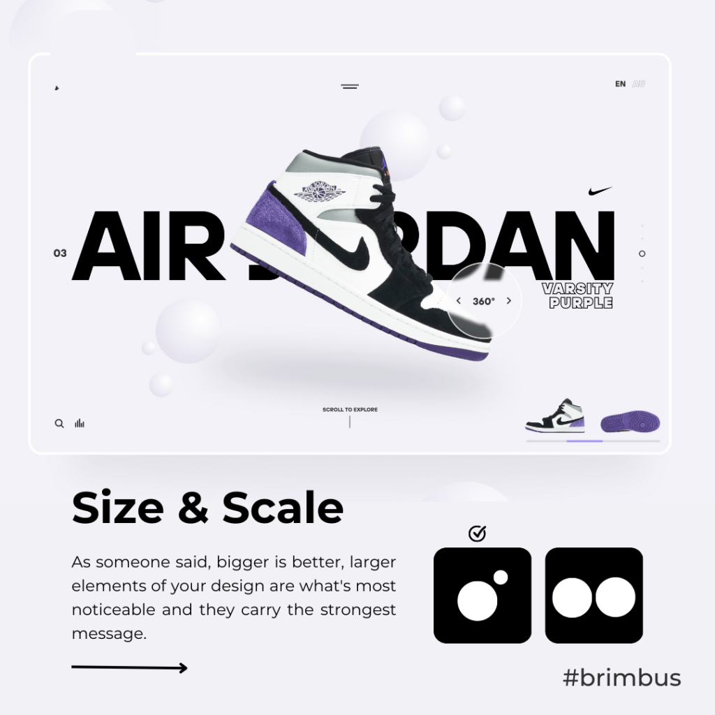
Notice in the above example how the largest word is also the most striking and emotive. Readers are much more likely to quickly respond to the word, “air jordan” than the second-largest word, the basic “varsity purple.” The design wouldn’t be nearly as effective if the words were the same size or if another word on the page, such as “360” or “scroll to explore”. However, it’s important to use size strategically and not just make everything bigger, as this can lead to a cluttered and overwhelming design. The 5 Principles Design of Visual Hierarchy have the size and scale of each element should be determined based on its importance and the overall balance of the composition.
Color & Contrast
InThe 5 Principles Design of Visual Hierarchy have the Color and contrast can be effective tools in establishing visual hierarchy in the design. When used correctly, they can help guide the viewer’s eye and communicate the importance and relationship between different elements on the page.

Example of using color & contrast to create hierarchy Source
The 5 Principles Design of Visual Hierarchy
Here are some ways color and contrast can be used to create a hierarchy:
- To distinguish between different levels of importance, use color. You can establish a distinct visual hierarchy by giving each degree of importance a particular hue. Consider using a more subdued hue for the elements that aren’t as vital and a strong, bold color for the ones that are.To emphasize something, use contrast. You may make an element stand out and grab the viewer’s attention by using a color contrast between it and its background. For instance, you could use a light font on a dark background for the most important content and a dark font on a light background for the less crucial information.
2. Use color to group related elements. By using the same color for elements that are related or belong to the same category, you can create a sense of unity and organization. For example, you could use a different color for each section of a website, or use the
3. Generally, color and contrast are effective design elements for establishing visual hierarchy. You may direct the viewer’s eye and convey the significance and relationships between various components on the page by using them properly.
Alignment

Example of using alignment to create hierarchy Source
Alignment is another important tool for creating hierarchy in the design. When elements are aligned deliberately, it helps to create a sense of structure and organization and makes it easier for the viewer to understand the relationship between different elements on the page.
Use alignment to create visual cues. By aligning elements deliberately, you can create visual cues that guide the viewer’s eye and communicate the importance and relationship between different elements on the page. For example, you could align headings to the left and body text to the right to create a clear hierarchy of information.
Overall, alignment is an important tool for creating a hierarchy in the design. By using consistent margins and spacing, aligning elements to a grid, and using
alignment to create visual cues and contrast, you can create a clear and effective visual hierarchy that guides the viewer’s eye and communicates the importance and relationship between different elements on the page.
Proximity
Proximity in visual design refers to the arrangement of visual elements in close proximity to each other to create a sense of relatedness or unity. It is a principle of design that helps to organize information and guide the viewer’s eye through the visual composition.

By arranging things in a certain way, alignment requires connecting them visually. This can be done by centering, aligning to the left or right, or constructing a grid. The 5 Principles Design of Visual Hierarchy Designers can engender a sense of organization, hierarchy, and unification in their compositions by applying the proximity concept to visual design. This can make the content easier to understand and more visually appealing to the viewer.

In visual design, whitespace refers to the area around and between design elements, such as text, images, or graphics. It is also known as negative space because it is typically the absence of content or design elements.
White space is an important design element because it can help to create balance, improve readability, and draw attention to important content. When used effectively, white space can enhance the overall design aesthetic and make the content more visually appealing.
Overall, white space is an important element in visual design because it can improve the overall aesthetic and functionality of a design. When used effectively, white space can make a design more visually appealing and engaging for the viewer.
Want to know about design?
5 Principles Design of Visual Hierarchy – Check out other blogs from the Brimbus blog where you can learn more about branding, packaging design, Web design, and more
Recent Posts
Related Posts